Love these bookshelves from the home of designer Lela Rose, featured in InStyle March 2013. It was smart to build them into that niche to make them flush with the wall at right.
Showing posts with label millwork. Show all posts
Tuesday, March 12, 2013
Wednesday, January 9, 2013
Great Wall Treatment
Neat wall treatment in the Park Ave apartment of Tom Samet, as featured in House Beautiful February 2013. Photography by Paul Raeside.
It would be ambitious, but with careful planning and a good chunk of time I think it could be DIY'ed. You could also break the grid and go for a less conventional arrangement. Smart how it can be used to conceal vents but still allow airflow, as they've done here above the door.
Friday, December 14, 2012
Edited Living in a Wooden Box
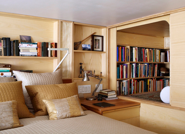
This is a super teeny tiny (180 s.f.) studio apartment in the Upper West Side, renovated by design-build architect Tim Seggerman. Love all of the nooks and crannies - no wasted space here. The sleeping loft, above the kitchen, even has a tiny, sitting room only "library."
More photos at Dwell and on the architect's site.
Thursday, November 29, 2012
I Want This Bookshelf
I love all things adjustable, flexible, and customizable. People's needs change over time, and it's nice to have furnishings that are able to adapt to those changes. This bookshelf makes me drool. The verticals are completely notched out at regular intervals, making it easy to move the shelves around and turning that functional aspect into a design element. Such an improvement over those ugly vertical lines of peg holes running up the insides of a bookcase.
Oh, and the rest of the project is lovely too. It is a Manhattan apartment designed by Len Morgan, featured in Elle Decor November 2012, in the article Made to Measure. Photos by Mikkel Vang. A couple of my favorite shots of the project are below, and more are available on the Elle Decor site.
Saturday, September 29, 2012
Instant Attraction: Home of Frank Muytjens
Lovely, light living room and bedroom from the weekend house of Frank Muytjens, J. Crew menswear director. These rooms feel so still, serene and peaceful.
As featured in Elle Decor October 2012: Vintage Variety. Images from www.elledecor.com. Photos by William Waldron.
Good Idea: Wrapping Countertop Material
Both of these images illustrate how you can wrap your countertop material around the cabinetry. This is a great solution for instances where you want to change counter height (top) as well as when your countertops don't end into a wall.
Images from Canada's Style at Home magazine, October 2012. Top image is from a redesign of a hospital lounge that was done by the magazine. Bottom image from the article "Opposites Attract." Photo by Monic Richard. Styling by Nicola Marc.
Thursday, September 27, 2012
Good Ideas: Panelling design
Lovely, stately panelling design from House Beautiful May 2012: Bath of the Month. Interior design by Karin Edwards. Photo by Jason Donnelly. I love the two contrasting finishes used on the panelling.
House Beautiful: California Cottage
Image from House Beautiful: California Cottage, July/Aug 2012. Interior Design by Stephen Shubel. Photos by Luca Trovato.
I love this platform seating. Very casual yet sophisticated. Great collection of pillows on top and who doesn't love a good box cushion?
Monday, June 11, 2012
Bulthaup Kitchens
The organizer in me just LOVES the way these kitchens are perfectly compartmentalized to accomodate all of your kitchen appliances, plates, glasses, food, and kitchen tools. You open it up, cook your dinner, then it all folds back up into a pair of sleek, warm, modern armoires (see below).
b2 by Bulthaup. Images from www.bulthaup.com.
Friday, June 1, 2012
Instant Attraction: Home of Alfredo Paredes and Brad Goldfarb
I love everything about this apartment. It's in the East Village, has a KILLER terrace, the architecture is so lovely, and the design that was implemented is gorgeous. I want it all. The materials palette, those windows!, the fireplaces, fixtures, millwork, furnitures, fabrics, the floor-to-ceiling wraparound draperies in the master bedroom. And that dog is a muffin too. What a retreat it must be to come home to this place.
All images by Miguel Flores-Vianna, from www.architecturaldigest.com. Featured in Architectural Digest April 2012, "Partners in Style".
Tuesday, April 24, 2012
Interior Design Exercises!
Every once in a while I get the itch to rearrange my furniture. There are lots of ways to re-imagine your surroundings using only what you already have and your creativity, but there is a limit to what you can do. So after shuffling our bedroom/office furniture around SO many times, I decided to just let myself go and imagine what I would do if I owned my apartment and could build out a custom bedroom/office space. Here are a few (bare bones) shots of my initial idea.
ABOVE: Overall view. This room serves as our sleeping area, dressing area, my work area, and my husband's music area and occasional work area. Those vertical rungs would be a rope wall, as seen here, on the amazing blog The Brick House. I love the way it breaks up the space without blocking the light from the window, and still allowing visual contact between the two sides, so the room isn't made to feel smaller. Or at least, I love the way I'm imagining it would do that.
ABOVE: My husband wants a whiteboard wall. I found this cool paint that you can roll on and turn any wall into a whiteboard! I'm sure there are other sources for whiteboard paint, but I didn't look hard at all since this is just an imaginary project. Anyway, here's the whiteboard wall.
ABOVE: The magical musical desk. I'd build the desk level to be just above the height of his keyboard and then make part of the desk flip open with a hinge so that it can be used as a laptop workstation some of the time, and a music area some of the time. Sheet music can be pinned to the cork board on the wall.
Friday, April 20, 2012
BDDW: Handmade American Furniture
A couple items from BDDW furniture.
Left: Bronze Trestle Table with charred wood top and cast bronze base. I love the contrast between the toughness of the charred wood and glitz of the gold-colored base.
Right: 72" Leather Mirror. This mirror looks great positioned above a long, low credenza. Unfussy drama.
Images from www.bddw.com.
Tuesday, April 17, 2012
Miles & May: more lovely joinery
More lovely furniture celebrating materials and craftsmanship seen at the AD Home Show. About Miles and May...
We believe that honest design articulated through unique material and impeccable craftsmanship will withstand the test of time. We design our furniture to showcase the history and character of each hand-selected piece of wood, rather than force-fitting the material into a specific design. Every item is also created by hand using both traditional methods and modern techniques. The final result is exceptional furniture that’s made to last a lifetime.
Above: Haven Low dresser. Love the joinery detail on the drawers and the blackened steel wrap.
Images of some more of their lovely pieces after the jump. All images from www.milesandmay.com...
Wednesday, April 11, 2012
Laron Algren Woodworking
I was lucky enough to sit in one of these rocking chairs at the AD Home Show. Boy, was it SOLID. This is a high-back rocking chair by Laron Algren Woodworking.
Image from www.laronalgren.com.
Tuesday, April 10, 2012
Analog Modern
Analog Modern...
is a Brooklyn-based furniture and design studio crafting bespoke outcomes. We are inspired by traditional joinery, and both ethically and aesthetically drawn towards using regional hardwoods and reclaimed materials in our pieces.Above: Detail image of a custom hydroponic kitchen island. It has grow lights underneath.In addition to their fiiiiine furniture, these folks also do tree houses! I strongly urge you to check them out. It appears they also offer a reclaimed furniture design/build workshop. I would LOVE to attend that to learn about traditional joinery techniques and walk away witha piece of furniture I built myself!More photos of their work after the jump. All images from www.analogmodern.com...
Monday, April 9, 2012
Keating Woodworks
A few weeks ago I attended the Architectural Digest Home Show. It was really great to see so many gorgeous furnitures pieces, lighting fixtures, etc. in person, all in one place. Vendors promoting furniture constructed using traditional joinery techniques and natural looking, unvarnished materials made up a strong contingent, which was really wonderful to me. I love the trend of celebrating materials and using traditional fabrication techniques. In this and the next few posts I'll highlight a few of the vendors whose pieces I drooled over.
Above: Detail of Keating Woodworks' Spindleback 2 1/2 chair. Love everything about it: material, construction, finishing. I love when you can see how things are put together. I also love the tagline of this company: Made in the Midwest With my Bare Hands. Don't get me wrong, I still love Ikea and their mission (to create a better everyday life for the many people), however there is something truly special about things made by hand. I like to think about (and appreciate) how much effort and time went into the creation of pieces like this. I think that if you can afford it, it's important to support craftsmen/women who can create such beautiful work as this.
Image from www.geoffreykeating.com, which, incidentally, is as beautiful a website as the goods it showcases. Here's another shot from the site:
Saturday, April 7, 2012
Angle Shelf by ALS Designs
I've been really into geometric/faceted design lately, so it's no surprise that I fell for this wall shelf by ALS Designs. The Angle Shelf is made of bamboo and finished with Tung Oil.
About ALS Designs:
ALS Designs is a Brooklyn-based furniture design company specializing in innovative designs with environmentally-friendly materials and practices. Designs are hand made by master craftsmen in the United States. Furniture ingredients are carefully selected based on quality and sustainability.
Learn more here.
Image from www.alsdesigns.com.
Friday, December 23, 2011
Good Idea: Shelving
Two nice shelving ideas from the December 2011 issue of Living Etc:
Left: What a nice way to integrate shelving around a bed and doorway. Photo by Manolo Yllera/Vincent Van Duysen Architects
Right: This (in a tree shape or some other playful shape) would be great for a child's room, or covering entire wall in a study or living room and filled with books and personal treasures and mementos. Photo by Camera Press.
Thursday, December 22, 2011
Instant Attraction: Timber-framed home
This home was featured in Living Etc, Dec 2011. Images scanned from the magazine. Styling by Anna Molvik. Photos by Matthew Williams.
I love that hard materials are mostly natural, rustic, and muted while the super luxurious and often brightly colored soft materials and a few shiny lacquered hard surfaces add just the right contrast. That staircase is beautiful, and the hammock pulls up and out of the way on a pulley system when the family needs space to entertain. How cool is that?
More photos of this home after the jump...
Sunday, December 18, 2011
Instant Attraction: The Home of Amy Butler
The home of Amy Butler was featured in the November 2011 issue of Living Etc. Photographs by Matthew Williams.
I LOVE this living room. So light and airy. Very crisp and clean, but very homey and bursting with personality. I love the wide plank wood floors and jute rug and other woven accents throughout. Those cats really seem to enjoy those large ottoman cubes topped with pillows. The far wall features one of Amy's wallpaper designs for Graham and Brown.
A look at Amy's kitchen after the jump...
Subscribe to:
Posts (Atom)