Monday, December 31, 2012

Astoria Project Peek

A view of the apartment's entry
So, I haven't forgotten about my own apartment challenge, but I've been so busy with other exciting projects that I haven't had a chance to post about it.  Here are a few sneak peaks at one of those other projects, an apartment in Astoria, Queens.  Look out for a complete set of images in the coming weeks on my website

With this project I got a chance to build one of the great black pipe shelving units seen here, on a blog I really love, The Brick House.  It was a LOT of work (prep and schlep), but I really loved how it turned out in the end.  Because the pipes and boards comes in all different lengths and sizes and can be cut to any length you want, it's possible to customize it to suit your needs.

Heading to the install with a tree in the car
Assembling a custom shelving unit with the super handy and fun Will
A glimpse at the finished and styled shelving

Friday, December 28, 2012

Instant Attraction: Study in the Home of Carlos Aparicio


This serene study is from the Home of Carlos Aparicio, as featured in Elle Decor December 2012 in the article Miami International.  This clean, white interior is kept from beng too sterile by the addition of warm, brown wood and leather elements and soft surfaces, especially that shaggy midcentury Swedish rug.  I really, really love that wrought-iron chair.  It is by Marc Du Plantier.

Lots more photos of this interior can be found at Elle Decor.  Photographs by Richard Powers.

Wednesday, December 26, 2012

Instant Attraction: Study in the Home fo John Robshaw


So much personality.  Very collected.  And the plants.  Love that rug.  Good trick to paint the ceiling a lighter shade of the color on the walls.  

Image from Elle Decor.  Photos by William Waldron.  Featured in Elle Decor December 2012: Home and Abroad

Friday, December 21, 2012

Instant Attraction: The Collected Home of Michael Formica


Images of the home of designer Michael Formica, as featured in House Beautiful December/January 2012.  Interior design by Michael Formica.  Photos by Bob Hiemstra.

I am a sucker for Kuba cloth, and I loved reading Michael's design philosophy: "Decorating isn't like following a recipe to make the perfect chocolate chip cookie.  It's about pulling from the world around you.  A house should be a self-portrait, or an autobiography."  And what I would do for an old cast stone fireplace like that!


Wednesday, December 19, 2012

Concrete Building Blocks


Images of the Pentimento House by architects David Barragán and Jose María Sáez.  This house is built out of standardized concrete building blocks that can be adapted to fit together and be used in a variety of ways to suit different functions.  You can read more about the building block system over at Dwell.

Images from Dwell December/January 2012.  Photos by João Canziani.


Friday, December 14, 2012

Edited Living in a Wooden Box


This is a super teeny tiny (180 s.f.) studio apartment in the Upper West Side, renovated by design-build architect Tim Seggerman.  Love all of the nooks and crannies - no wasted space here.  The sleeping loft, above the kitchen, even has a tiny, sitting room only "library."

More photos at Dwell and on the architect's site.


Wednesday, December 12, 2012

So cool - Staircase House in Tokyo


Definitely check out this home, featured in Dwell, November 2012.  It is basically one giant winding staircase with larger "steps" serving as rooms.  The material contrast between the steps and the walls really highlights the staircase.  I love how the Dwell article bills it as a "921-square-foot, 44-level house."  Amazing.

Project: Coil House, by architect Akihisa Hirata.  More photos can be seen on Dwell and on the architect's site.


Friday, December 7, 2012

Open-Yet-Divided Living Area


What I really love about this feature (Lines in the Sand, Architectural Digest November 2012, Photos by Pieter Estersohn, design by Olson Kundig Architects) is that it allows you to see the overall view of this amazing, open living space, and then also to see a ground level view of each of the zones.

There's the living/sitting zone with that great fireplace:

Then there's the game table/library zone:

And finally that great outdoor, beachside seating area, which can be separated from the indoor zones by glass doors:

Overall a beautiful project.  Great natural palette and good division of space that still maintains a very open feeling.  I love the use of that horizontal wood "canopy" that creates the feeling of a hallway and breaks up the vertical space.

Wednesday, December 5, 2012

Gorgeous Painted Floor Pattern


Really beautiful painted floor from the family home of designer Alex Papachristidis, as featured in Architectural Digest November 2012 in the article The Gathering Place.  Photo by William Waldron.

Monday, December 3, 2012

Apartment Challenge :: What I'm Working With


So, here it is.  This is an overall "before" shot of the living/dining area.  It's been through a few different arrangements and incarnations, but this is what it looks like at the moment.  It's pretty bare because I've already taken down a bunch of artwork to prep for the revamp, but I'll show some photos of the "before befores" when I break down each zone.  See below for more photos with notes on some general goals.

Here's a shot of each side of the living area...
Everything in this living area is so low (and we are running out of shelf space for our growing book collection), so I think I want to bring the cubby bookshelves up two more rows on the left hand side.    They are these simple and great unfinished bookshelves from, you guessed it, and unfinished wood store in Rhode Island.  We keep getting more and more.  It makes sense for us, because we can break them up and reconfigure them in SO many ways to adapt to wherever we might live next.  And once I get my dream bookcase, these could be great secondary storage, to plop baskets in and use for kids' toys, laundry detergent, whatever.  To combat the clutter of our little trinkety things, I might experiment with shallow/ledge shelving painted the same color as the wall (like this).  I love all of our little collectible things because they are reminders of good memories, but right now they're all cluttered up on top of those bookshelves and it's just weird and messy.  The sofa is Ikea, and while there's nothing wrong with that, I think that by swapping out the legs for something more discreet and less blocky I can make it look a bit more refined.  I'll go with something tapered and in a darker finish.  Those storage cubes - also Ikea - are great and super functional (our apartment has only ONE closet, so we need to find ways to add storage wherever we can) but the perforated sides and tops let crumbs fall through and let you see all the junk we're hiding inside, so I want to add some fabric wrapped panels to solve those problems.  And then the artwork.  We've got a bunch of things that we like and have collected over time, but the frames are all different and I am tired of that look.  So I am going to find a way to unify the frames and then rehang all of the artwork over the sofa.

And now, shots of a wall just inside the entry door and the dining area...
I have a lovely set of Audubon bird prints that were a gift from a good friend that I want to frame (in matching frames) and hang up that small wall.  I can cover the phone jack, but the switch and awful telephone buzzer will be sticking around.  I might replace or refinish the little table on that wall.  It's where my husb drops his keys/wallet/pocket change/every business card he ever gets.  That piece there was something my mom found and gave to us, and while it has its charms, I think I'd like to graduate up to something nicer and that fills the wall a bit more.

The dining area is sooo bare right now, I know.  We used to have some of our artwork collaged above it.  I liked it, but we had all these artwork walls all over the place and it was so busy, so now I want to add something BIG there.  I think we can make a real moment out of this little dining space.  Ideally I'd love a gorgeous textile in a deep navy or charcoal, but since I have limited budget and limited patience for trolling ebay/craigslist, I think I may end up doing a diy here.  I'd rather splurge on some great lighting above the table and some nice linens.  Just ignore the chairs and table, I know they're not great.  Whatevs, they were cheapo.  Someday we'll upgrade and relegate these to a secondary room, but for now they're functional and not too ugly.

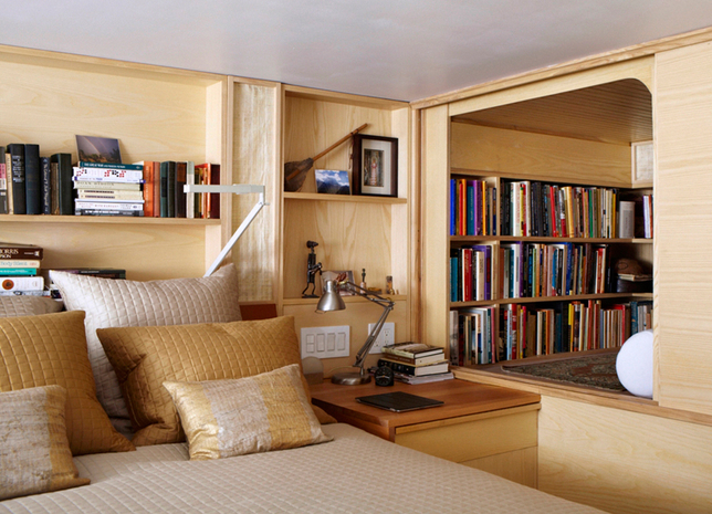
And a couple shots of the bedroom...
The bedroom has been re-shuffled SO many times.  It's always been half home office/half sleeping area (NOT ideal, I know), but it used to be more divided.  Now it's open.  Each arrangement has its pros and cons, but for now we are sticking with the open arrangement since it's much lighter and brighter.  We've already done a lot in here, but I still need some bed side tables, reading lights, some organization and a bit more storage, and then just some accessorizing for the bed.

So there you have it.  That's what I'm working with.  I plan to blog about each little project I take on and show inspiration research, progress photos, and final product as I go.  I'm also open to hearing any suggestions and ideas you have.  What would you do if this was your home?

Oh wait, one last photo.  This is the chunk muffin who lives here with us and has to approve of any changes.