So, here it is. This is an overall "before" shot of the living/dining area. It's been through a few different arrangements and incarnations, but this is what it looks like at the moment. It's pretty bare because I've already taken down a bunch of artwork to prep for the revamp, but I'll show some photos of the "before befores" when I break down each zone. See below for more photos with notes on some general goals.
Here's a shot of each side of the living area...

Everything in this living area is so low (and we are running out of shelf space for our growing book collection), so I think I want to bring the cubby bookshelves up two more rows on the left hand side. They are these simple and great unfinished bookshelves from, you guessed it, and unfinished wood store in Rhode Island. We keep getting more and more. It makes sense for us, because we can break them up and reconfigure them in SO many ways to adapt to wherever we might live next. And once I get
my dream bookcase, these could be great secondary storage, to plop baskets in and use for kids' toys, laundry detergent, whatever. To combat the clutter of our little trinkety things, I might experiment with shallow/ledge shelving painted the same color as the wall (like
this). I love all of our little collectible things because they are reminders of good memories, but right now they're all cluttered up on top of those bookshelves and it's just weird and messy. The sofa is Ikea, and while there's nothing wrong with that, I think that by swapping out the legs for something more discreet and less blocky I can make it look a bit more refined. I'll go with something tapered and in a darker finish. Those storage cubes - also Ikea - are great and super functional (our apartment has only ONE closet, so we need to find ways to add storage wherever we can) but the perforated sides and tops let crumbs fall through and let you see all the junk we're hiding inside, so I want to add some fabric wrapped panels to solve those problems. And then the artwork. We've got a bunch of things that we like and have collected over time, but the frames are all different and I am tired of that look. So I am going to find a way to unify the frames and then rehang all of the artwork over the sofa.
And now, shots of a wall just inside the entry door and the dining area...
I have a lovely set of Audubon bird prints that were a gift from a good friend that I want to frame (in matching frames) and hang up that small wall. I can cover the phone jack, but the switch and awful telephone buzzer will be sticking around. I might replace or refinish the little table on that wall. It's where my husb drops his keys/wallet/pocket change/every business card he ever gets. That piece there was something my mom found and gave to us, and while it has its charms, I think I'd like to graduate up to something nicer and that fills the wall a bit more.
The dining area is sooo bare right now, I know. We used to have some of our artwork collaged above it. I liked it, but we had all these artwork walls all over the place and it was so busy, so now I want to add something BIG there. I think we can make a real moment out of this little dining space. Ideally I'd love a gorgeous textile in a deep navy or charcoal, but since I have limited budget and limited patience for trolling ebay/craigslist, I think I may end up doing a diy here. I'd rather splurge on some great lighting above the table and some nice linens. Just ignore the chairs and table, I know they're not great. Whatevs, they were cheapo. Someday we'll upgrade and relegate these to a secondary room, but for now they're functional and not too ugly.
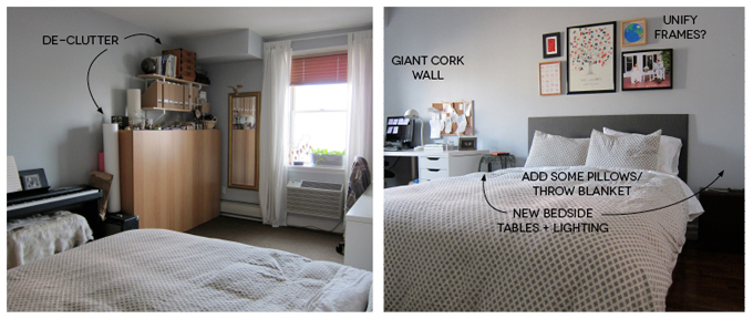
And a couple shots of the bedroom...
The bedroom has been re-shuffled SO many times. It's always been half home office/half sleeping area (NOT ideal, I know), but it used to be more divided. Now it's open. Each arrangement has its pros and cons, but for now we are sticking with the open arrangement since it's much lighter and brighter. We've already done a lot in here, but I still need some bed side tables, reading lights, some organization and a bit more storage, and then just some accessorizing for the bed.
So there you have it. That's what I'm working with. I plan to blog about each little project I take on and show inspiration research, progress photos, and final product as I go. I'm also open to hearing any suggestions and ideas you have. What would you do if this was your home?
Oh wait, one last photo. This is the chunk muffin who lives here with us and has to approve of any changes.