Thursday, June 27, 2013

Apartment Challenge :: An Early Finish


A while back I started a (sporadic) little series, posting about projects I was taking on in my own apartment to spruce it up a bit.  Well, as these things happen, we ended up moving out before I completed all of the projects I'd had in mind - though really, a home should be a reflection of your life, and as such it is always a work in progress!  Here I'm sharing the final photos of our place as it was just before we moved.  


You can probably see that I did replace the sofa legs (read part one of that project here), a minor detail that to me makes a huge difference.  There were lots of little things that I never got around to, like rehanging curtains or doing anything to jazz up the dining area, and I did diddly in the bedroom/office.  But we'll always remember that place fondly.  We were happy and comfortable there for 2.5 super transformative years.  In moving, one of the most amazing things was seeing just how much we had fit into a rather small one-bedroom apartment.  By living an edited life and making sure that every inch of closet and storage space was organized and used in the most efficient way possible, we were able to keep visible areas and surfaces pretty clutter-free and comfortable.  Once spread out, all of our "stuff" managed to fill our new, much larger place with no problem.  

Stay tuned for future photos of our new place!

Tuesday, June 25, 2013

Great Grates & Gates - Pattern Inspiration


Washington DC
Everywhere I go I see such great patterns!  Just a quick little post to share some of the ones I liked enough to remember later.

Boston, MA

New York, NY

Stockholm, Sweden

Oslo, Norway


Helsingor, Denmark

Thursday, June 20, 2013

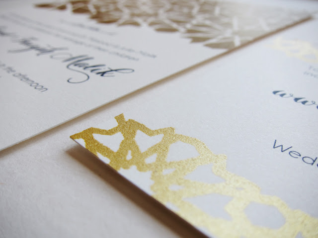
Screen Printed Wedding Paper Suite :: Islamic Geometric Patterns


Late last year I was contacted by a couple looking for custom wedding invitations and paper suite to complement their modern Muslim wedding.  Faizah & Zaahir (watch their adorable NY Times vows video here) came to me with a super clear vision of what they wanted: a suite of coordinating pieces including invites, guest info cards, escort cards, menus, programs, guest totes and even background graphics for their wedding website and photobooth.  

While Faizah initially found me through my Etsy shop, they both lived in Brooklyn so we were lucky enough to meet in person to talk about what they wanted and flip through the book Islamic Geometric Patterns by Erig Broug, selecting various patterns to use throughout their paper suite.  Over the course of the next few months I worked to churn out the various components.  

First came the background graphic for their wedding website...


Then the invitations...

Invitation and Info Card

Invitation detail

Screen printing detail

And finally the pieces for the wedding day itself, even including glam, gold patterned canvas totes for hotel guests!

Programs, back and front

Program back detail

Program front detail

Donation Cards

Escort Cards

Menus

Guest Totes and Welcome Notes

Guest Tote and Welcome Note detail

Guest Tote detail

In the end I was super pleased with the results.  It was tons of work, but I always get so much fulfillment out of hand-preparing the screens and printing and cutting each piece.  There's nothing like the satisfaction of seeing the stacks of completed paper goods that you made yourself, and it's an honor to be able to provide a couple with an important component to one of the most important days of their lives.  

One of my favorite parts of the process was seeing how the photobooth graphic turned out.  Their photobooth setup was done by We Love Photobooths.


Tuesday, June 18, 2013

Wall Pattern Painting in Queens


It's nuts that it is mid-June and I am just getting around to posting about these wall patterns I painted for a client back in early April.  Of course I could never have done this myself - I had the help of two seriously amazing friends who for some reason like me enough to spend three days stenciling, taping, painting, peeling and touching up hexagonal wall patterns with me.

Hugest thanks to Will and Ri
So, this was a LOT of work.  Firstly I designed the patterns in line with a hexagon motif that repeats throughout the clients' home.  Then I had to think a lot about how to get those designs off paper and onto the wall.  I considered ordering custom stencils, making my own large-scale adhesive stencils, snapping chalk guide lines onto the wall and drawing the pattern using those, and finally settled on making a small stencil of a repeating unit that we could move and trace along the wall.

First we traced, then we taped...


Then we painted...


And we stencilled while we taped and we taped while we painted.  All the while we talked about the meaning of life and how Fergie really likes to spell things in her songs.  And Will kept saying "le doy" and Ri was worried he'd start saying it all the time, for real.  Then the paint was dry and we peeled off the tape.

The next day we worked to touch up what we lovingly termed "the poop stains."  And the messy edges - why doesn't painter's tape ever work the way it should??


On the second day we also got down to it with the pattern for a wall in the foyer.  Same process...
We stencilled and we taped...


Then we covered everything up and Will donned a pair of disposable slippers and face mask and created a dusty, golden storm in the foyer.  When the paint was dry we peeled off the tape...


Of course some touch ups were needed, which we did on the third day, but after that - voilà - the super dramatic entrance that the home owners were after.

Stay tuned for a future post showing progress shots of the entire project!

Thursday, June 13, 2013

Park Slope Brownstone Project - Progress Shots


Well, I have not blogged in a really long time.  It has been an insanely busy few months and I'm excited to have a minute to get back on the blog and share some of what's been keeping me occupied.  I've been working in collaboration with Sarah Coleman Interior Design on the interiors of a brownstone in Park Slope, Brooklyn.  This space has absolutely beautiful architectural detail, and we've begun to source furnishings and decorative accessories to make the space feel more finished and welcoming for the family who lives there.  

Here I'm sharing some progress photos of the first phase of the project: the parlour.  These spaces are meant to be where the adults of the house can unwind and entertain.  We've divided this long space into a drinks area and a tv/lounge area.  Still awaiting some upholstery pieces to flesh out the seating areas, plus the all-important window treatments, but I think we're really on our way to a gorgeous finished space!


Just look at the difference!  How amazing is the George cocktail table from Oly Studio?  Sarah and I both had our eye on that piece and were excited to have the chance to use it in this project.  It's such a great counterpoint to the traditional styling of the sofa.  The table on the right-hand side of the far end of the room will eventually be moved downstairs to serve as a bistro table, and this beautiful, mammoth cabinet that the homeowners already had will move to that spot and serve as a bar cabinet:


And here's one final progress shot of the fireplace.  We added some height with this great carved bone mirror and étagère from Ballard Designs.


Stay tuned for more shots of the space with in all its finished glory, as well as updates on the progress of the next stages of the project: dining room and family room.